Dashboards
Once you have created your queries from the data packages, you can create fully customisable, visual dashboards to make the data look more presentable and easier to understand.
To create a dashboard select 'Dashboards' on the panel on the left-hand side. Then click 'Add New Dashboard'.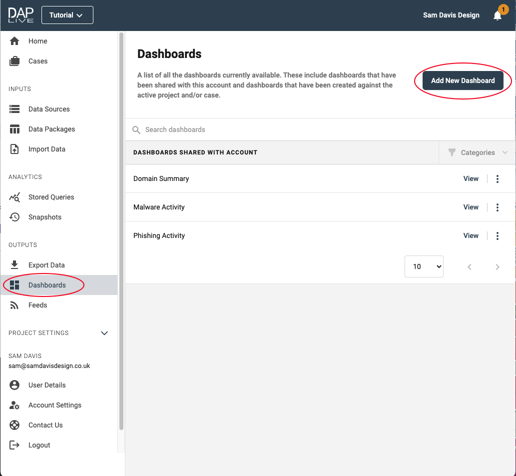
Give your dashboard a title and begin configuring by dragging and dropping which function you would like to include.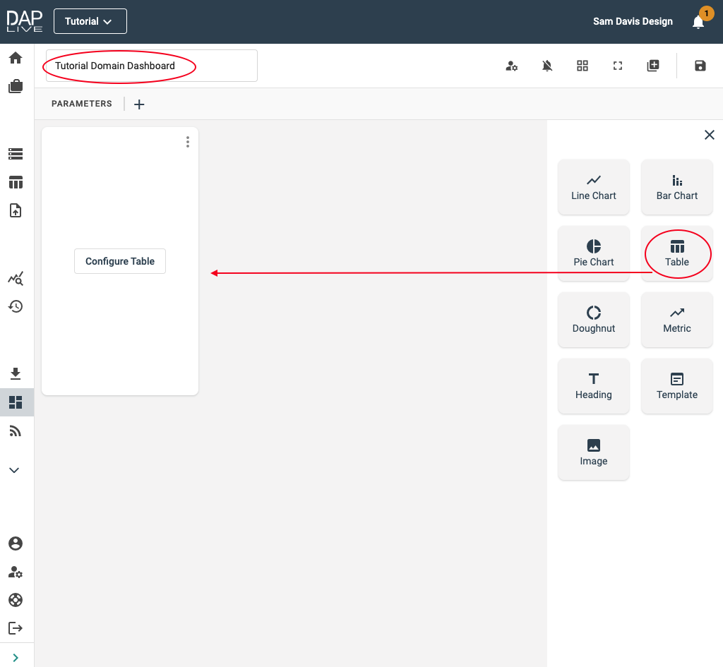
In this example, we are including a Table, Doughnut Chart and Bar Chart. Select which data you would like to create the table using. Then complete a title and head back to the dashboard where you will be able to see the table.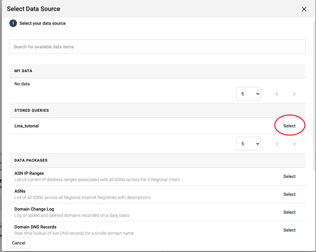
In order to include a chart of any kind, you need to repeat the process above - as well as a few other steps.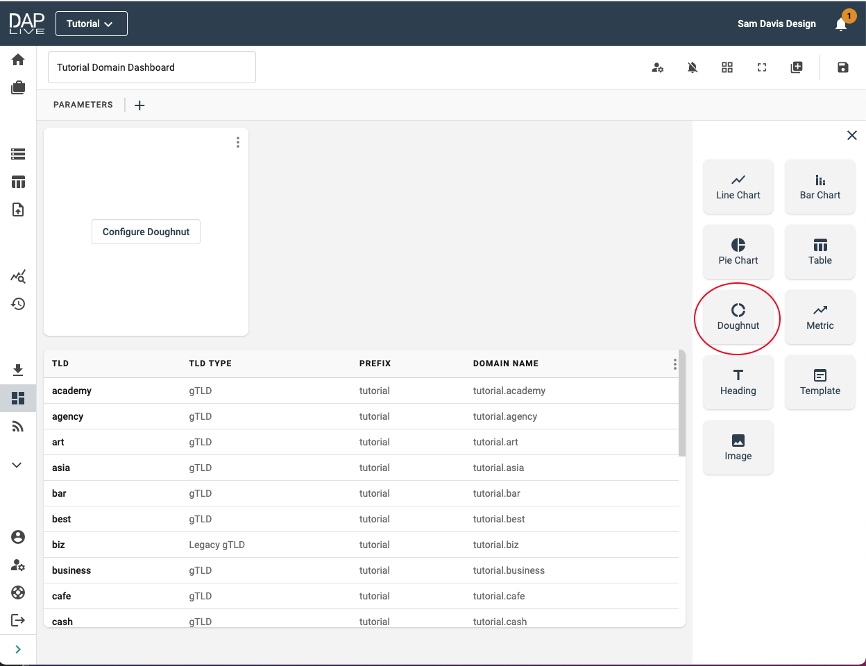
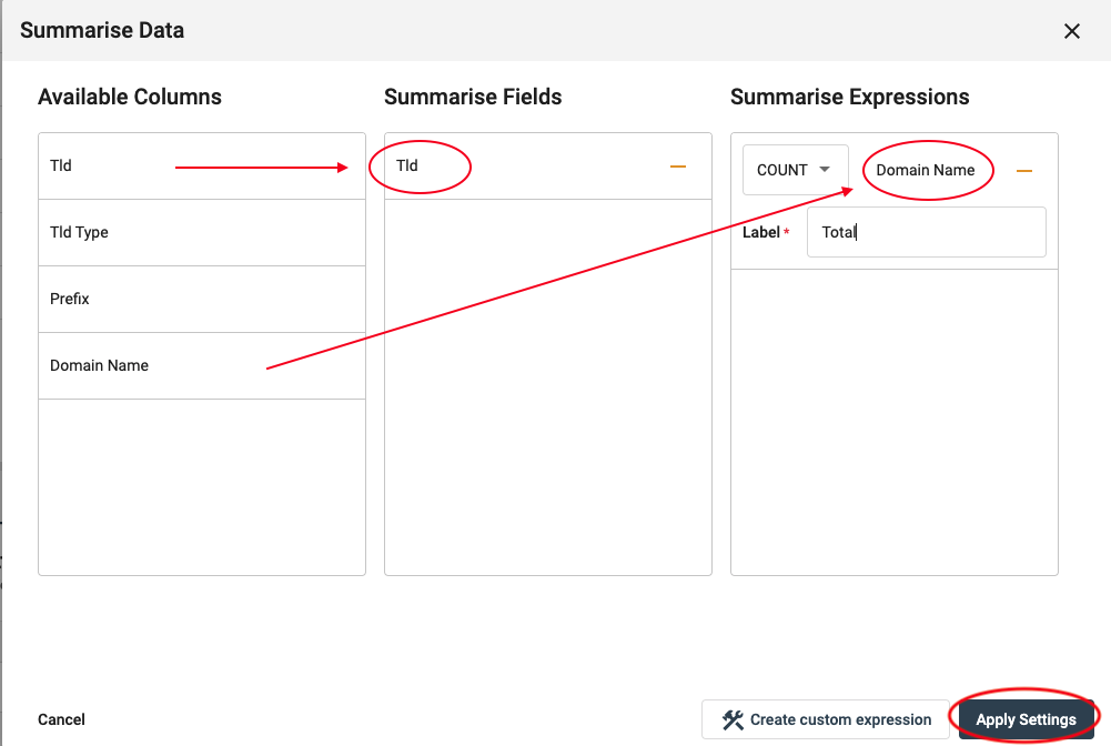
Additionally, you need to summarise the data. In this example we will summarise the Tld type by the total number of domain names.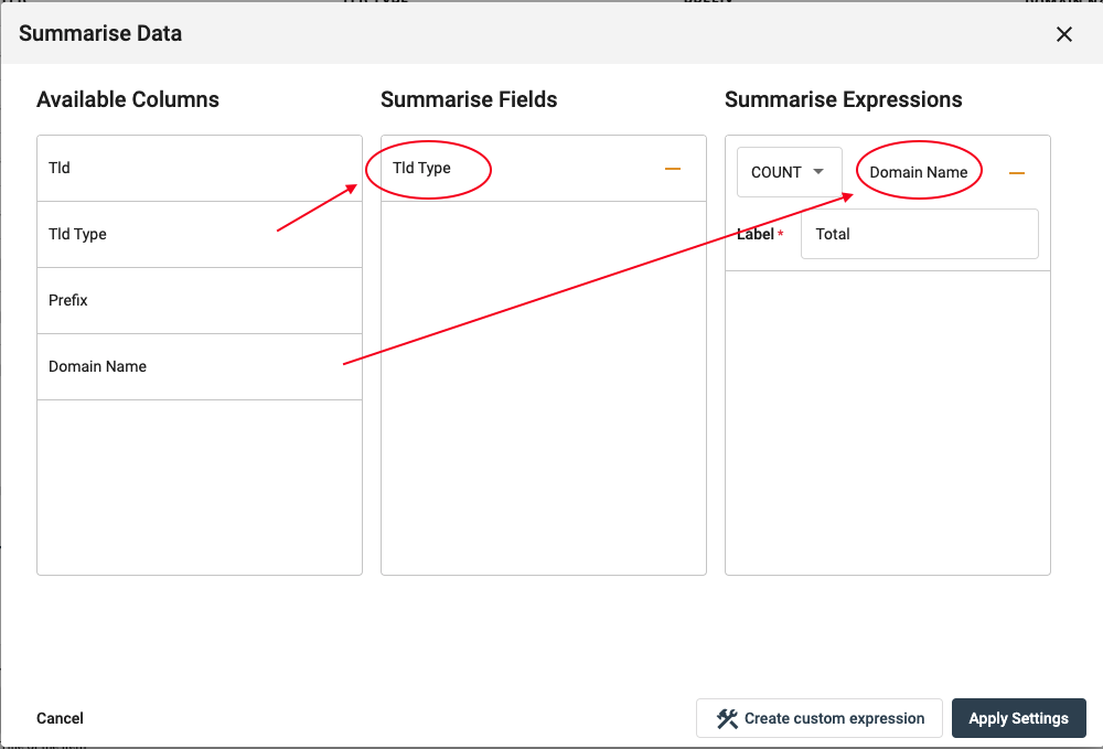
You also need to determine which labels and values are used within the chart. Configure this by selecting the chart header in the bottom window. Here you are also able to select a colour gradient for your chart.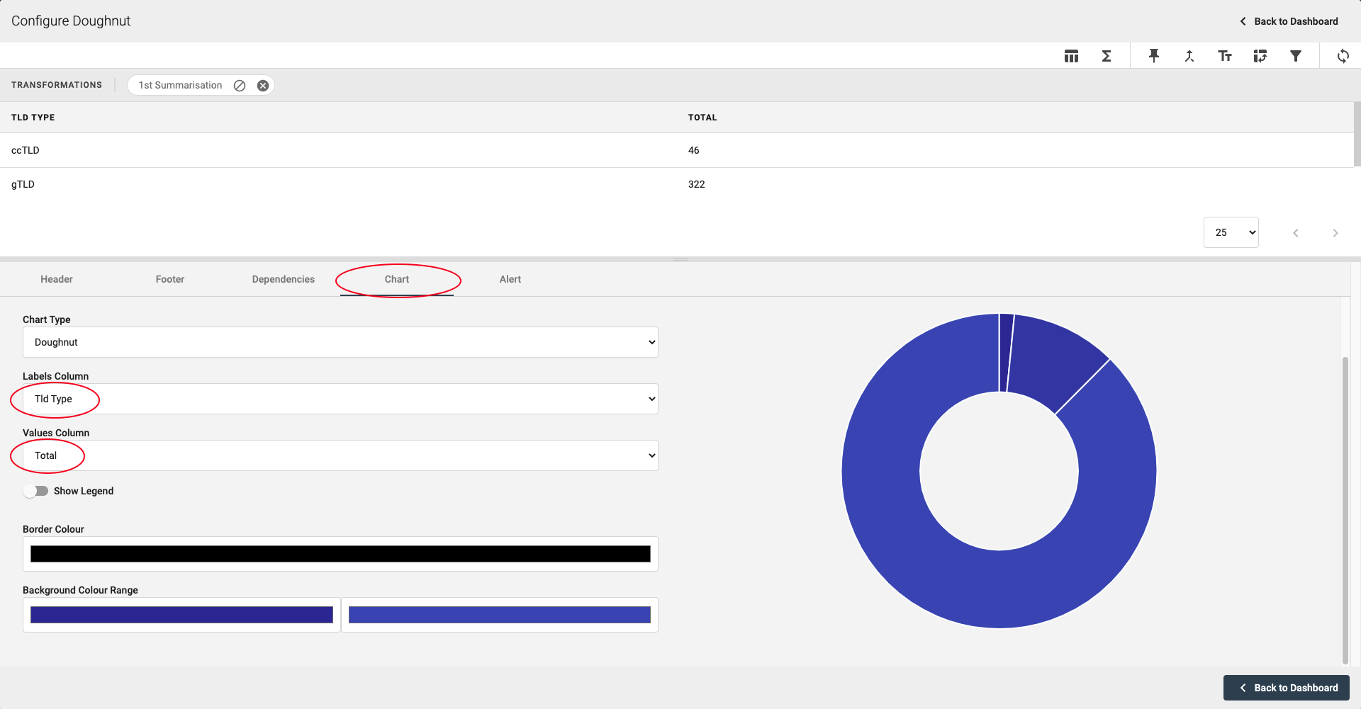
In order to include a bar chart, follow a similar process as above; selecting the different data you want displayed.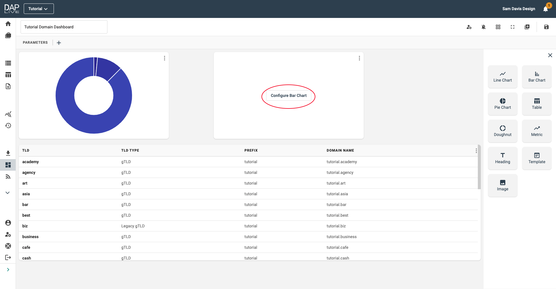
The result will be presented as below.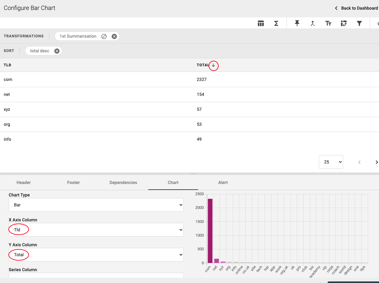
Once you have completed your dashboard, save it.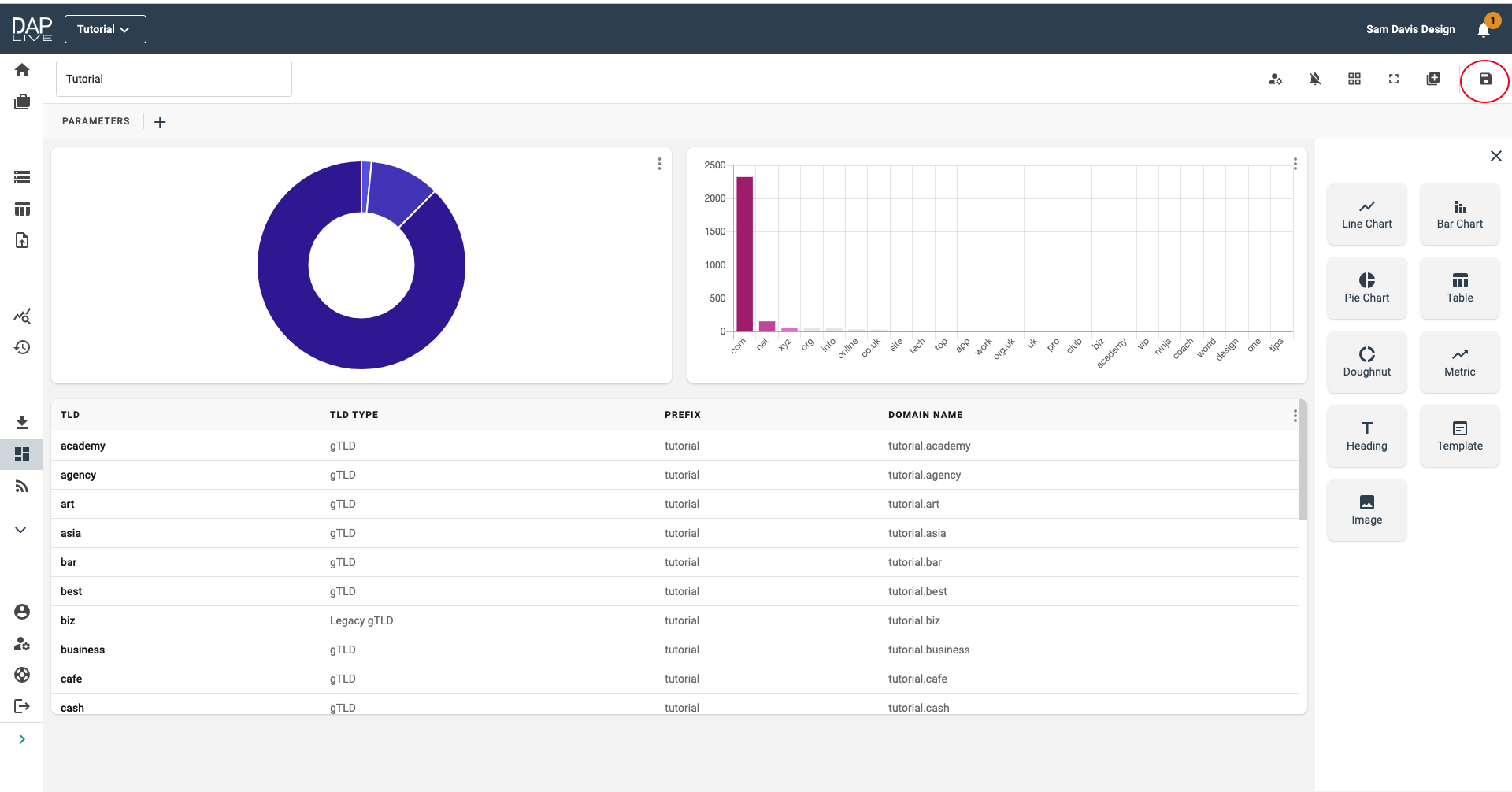
You can view all your project dashboards within your account at any time and they will update to give you the most up to date data within the DAP.LIVE system.