It can be very useful to present your data as a Pie Chart.
Pie Chart Icon
Give your dashboard a title and begin configuring by dragging and dropping the Pie Chart icon onto the screen. Then click 'Configure Pie Chart'.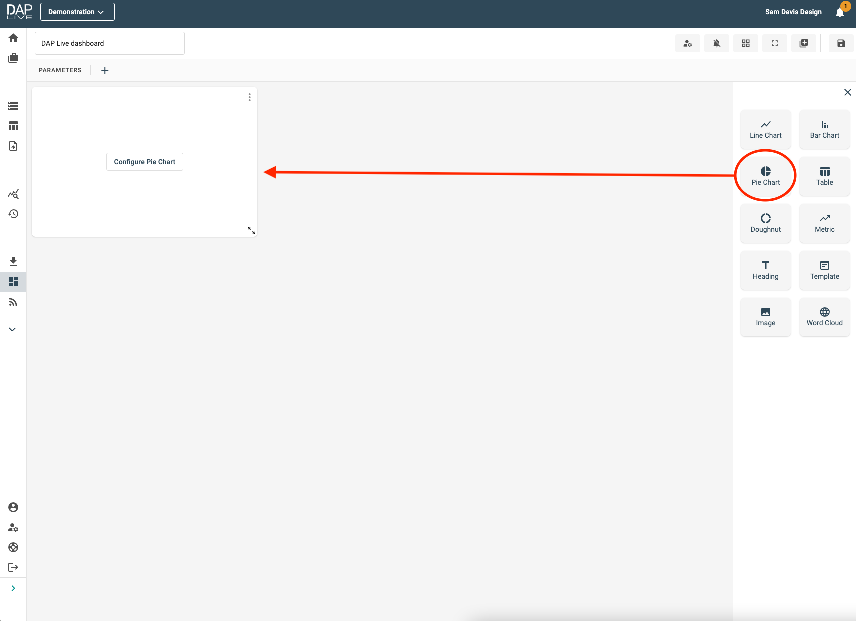
Choosing Your Data Source
Select which data, stored query, data feed or snapshot you would like to create a Pie Chart from.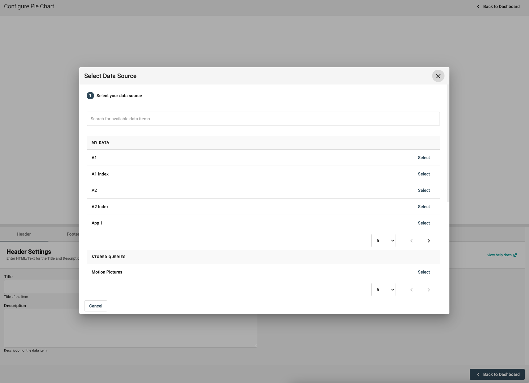
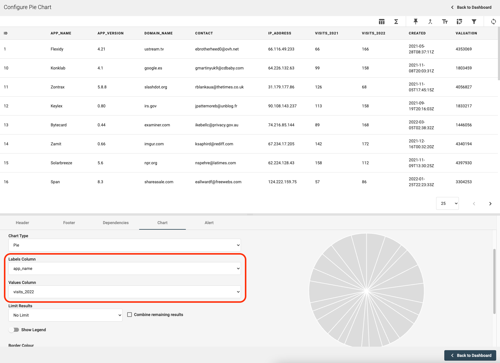
Choosing The Data To Display
Name your Pie Chart under the 'Header' section and then click on the 'Charts' section. Here you will be able to select which columns of data you would like to set as your labels and values for each sector of your Pie Chart. If your data does not already contain numerical values that you want to be included in the Pie Chart, you can still use the tools on the top right-hand side of the page to join another query, add a formula or summarise the data.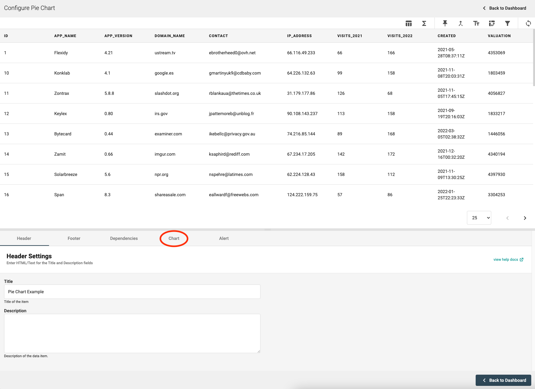
Visual Adjustments
You can set various colour gradients for your Pie Chart and a preview of what your chart will look like is shown on the right. Once you are happy with your Pie Chart, simply click 'Back to Dashboard' in the bottom right-hand corner.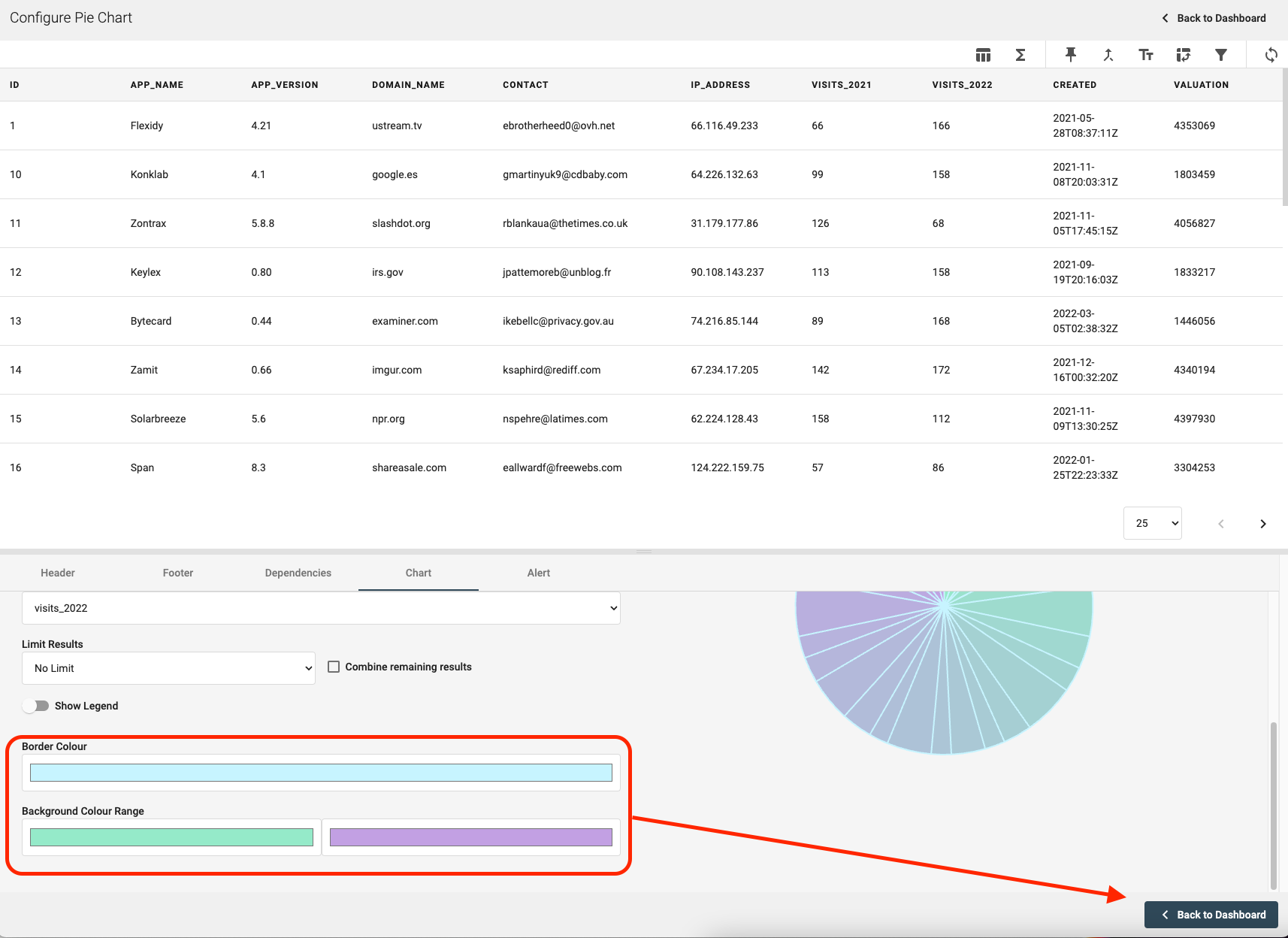
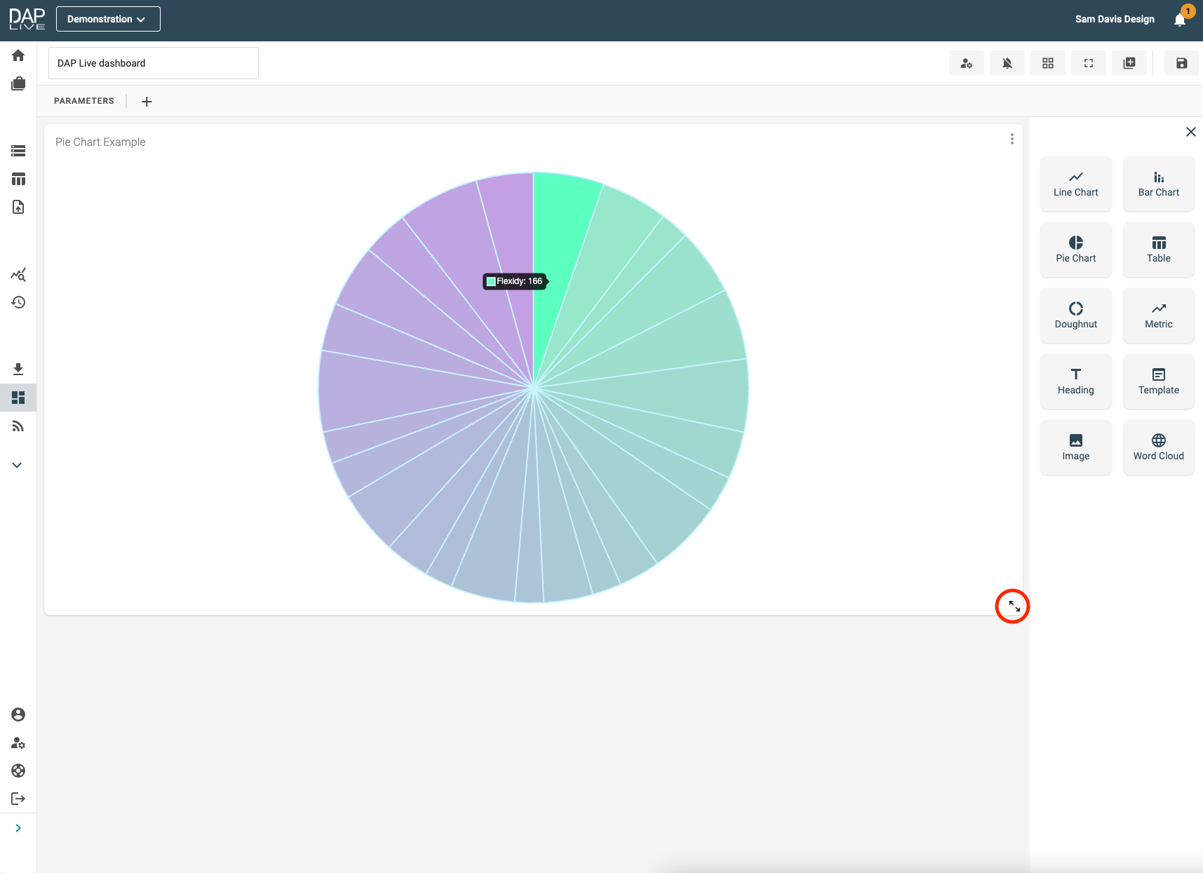
Dashboard Display
Now your Pie Chart will be displayed on the Dashboard where you are able to resize it as you wish. As you hover your mouse over each sector, the appropriate data will be displayed.